Get Your Website Analytics via Weekly Infographic!
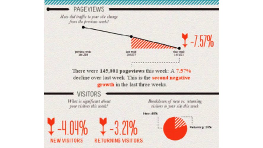
There are many tools that help you easily create infographics (easel.ly, piktochart, venngage, among others). One of the tools we use, visual.ly, recently introduced its Google Analytics report which sends you a custom infographic of your website’s performance each week, including change in page views, time spent per visit, new vs. returning visitors and more! It also shows how you’re doing with social engagement (Facebook and Twitter traffic). It’s a great way to check progress on a weekly basis. Learn more here.
While we’re on the topic of infographics, I’m finding that it’s easy for a non-designer (like me) to get carried away when creating infographics. (I know, I use too many fonts and colors.) So I thought I’d share these helpful tips for designing infographics from makeuseof.com:
- Keep it simple! Don’t try to do too much in one picture.
- Decide on a colour scheme.
- Research some great facts and statistics.
- Think of it as a visual essay: ensure your arguments hold and are relevant.
- Remember that it’s all about quickly conveying the meaning behind complex data.
- Draw conclusions.
- Reference your facts in the infographic.
- Include your URL so people can be sure who made it.
Cindee specializes in value proposition/messaging development, PR-AR-social and demand generation activities; she is a published author in several outlets, including Harvard Business Review.

